Case Study
Enhancing Public Health Awareness in Ontario Through Data Visualization
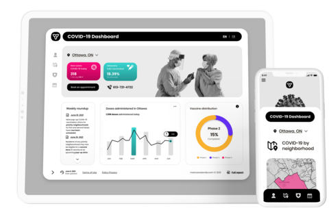
The COVID-19 Ontario Dashboard project aimed to transform complex pandemic data into an intuitive, accessible visualization platform that helps residents understand the correlation between health metrics and provincial regulations.
Role
UX/UI Designer
Tools
Figma, Sketch, Whimsical
Duration:
2 weeks, March 2020

Dashboard
Challenges
- Existing dashboards were data-rich but visually overwhelming
- Users struggled to understand the relationship between health metrics and social restrictions
- Information architecture needed to accommodate frequent updates
- Multiple user groups required different levels of data granularity
Goals
- Simplify complex epidemiological data for public understanding
- Create an intuitive interface that adapts to various user needs
- Establish clear visual connections between health metrics and social measures
- Ensure accessibility across all devices
Purpose
- To improve public understanding of pandemic-related regulations and health metrics
- To facilitate informed decision-making through clear data visualization
- To support community health awareness through accessible information design
UX Audit & Insights
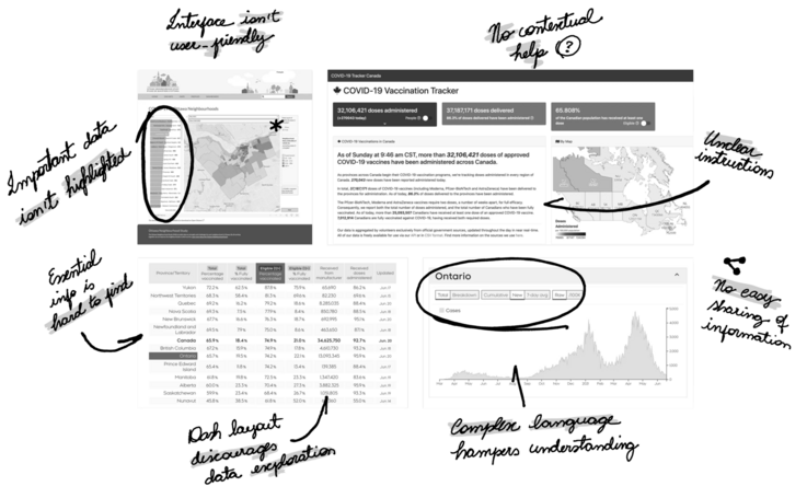
While offering valuable data, most Ontario Dashboards look confusing and not intuitive.

Insight Clustering
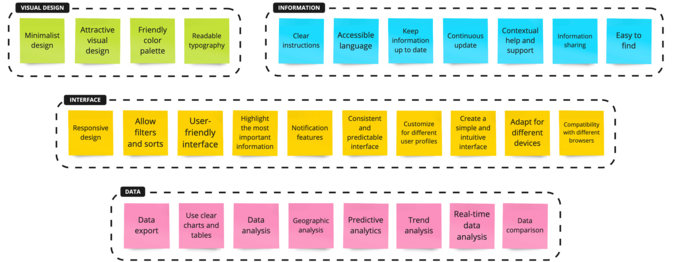
Based on the findings, I organized the major issues, turning them into potential opportunities to explore and group the topic’s similarities so that the requirement may be analyse later in the project
User Profile
The project’s user segmentation was based on the Susceptible-Infected-Recovered (SIR) model, an epidemiological framework that characterizes the pandemic’s exponential behavior through social behavior factors.


This model allows me to categorize users into three (3) distinct segments. susceptible-infected recouverd.

- Susceptible: individuals who are at high risk of contracting the diseases
- Infected: Individuals who are currently infected and capable of spreading disease
- Recovered: Individuals who are previously infected, recover and now have temporary immunity.
User Goals, Tasks And Actions
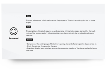
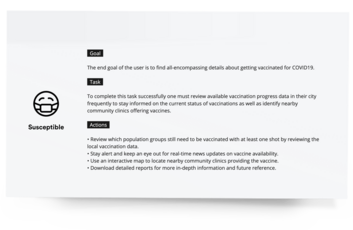
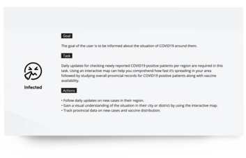
After analyzing user profiles and implementing a goals-tasks-actions methodology, I effectively identified user intentions, determined necessary activities, and established clear user pathways. By articulating these elements for Susceptible, Infected, and Recovered user groups, I created pivotal guidelines for the dashboard design, ensuring platform features aligned precisely with each user profile’s unique needs and objectives.
The analysis of user interaction data helped validate the dashboard’s complexity and navigation effectiveness. To measure this, I focused on key metrics including task completion rates, time-on-task, and user engagement patterns, providing actionable insights into the dashboard’s functionality and user experience.
Information Achitectured
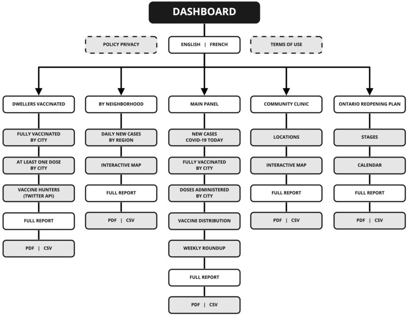
Through comprehensive user profile analysis, I identified key features that shaped the dashboard’s information architecture. Users frequently needed to understand and adapt to new regulations, beyond simply receiving pandemic updates. This insight led to the development of visual representations that clearly illustrated the correlations between pandemic data and lockdown rules, making complex relationships accessible to lay users.
Data Representation
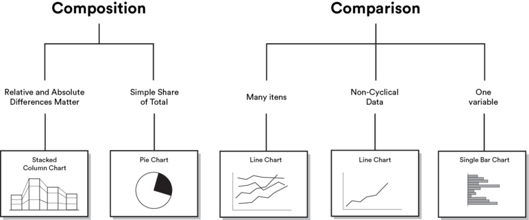
Building upon prior research insights, I developed a data visualization system that enables users to effortlessly compare multiple variables while maintaining the context of the broader dataset. Through careful mapping of user requirements to visual elements, I created intuitive representations of both relative and absolute values. This approach empowered users to understand complex correlations between pandemic metrics and lockdown rules, facilitating more informed decision-making.
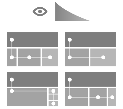
I designed the layout with a continuous flow pattern that facilitates natural scanning and information processing. The design follows Western reading patterns (left-to-right, top-to-bottom) to optimize desktop navigation and content hierarchy. This deliberate flow enhances user experience by improving information retention and comprehension. Through iterative sketching, I developed a compelling visual system that effectively represents complex data sets while maintaining intuitive navigation.
Sketchs
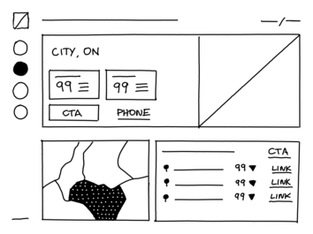
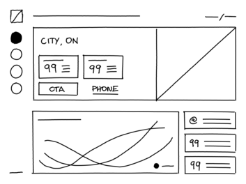
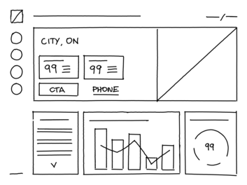
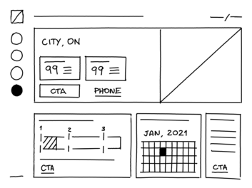
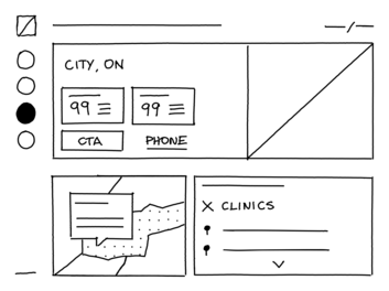
After analyzing and identifying various interests, I started designing, considering the hypothesis that minimalist design can easily adapt to the amount of information. I have decided to create a separate menu as this solution enables the logical separation of data to facilitate the user journey, allowing users to focus on ensuring intuitive navigation across these information segments, ensuring visibility of essential KPIs
After that, i created a sketch on a remarkable 2, considering the data visualization principle for data storytelling. in addition, I defined the visual hierarchy to highlight the most relevant facts based on the requirements. Finally, the time was ripe to focus on the interface after defining the style guides and the dashboard structures
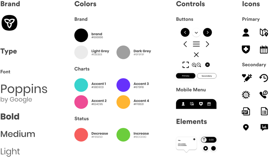
Style Guides
Incorporating Gestalt principles, the style guide establishes a user-centric aesthetic foundation. The minimalist approach and card-based navigation system enhance focus on key information while facilitating intuitive understanding of content relationships. Custom-modified icons from a streamlined library ensure visual cohesion throughout the interface. The monochromatic color scheme, punctuated with bright accents, maximizes contrast and improves readability.
User Interface (UI)
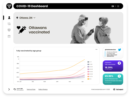
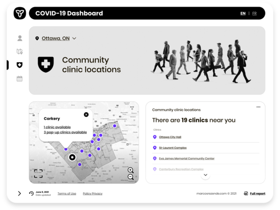
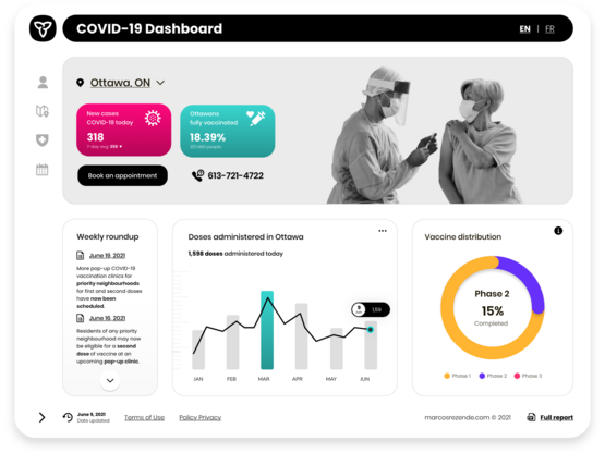
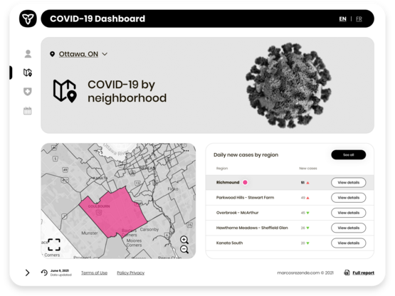
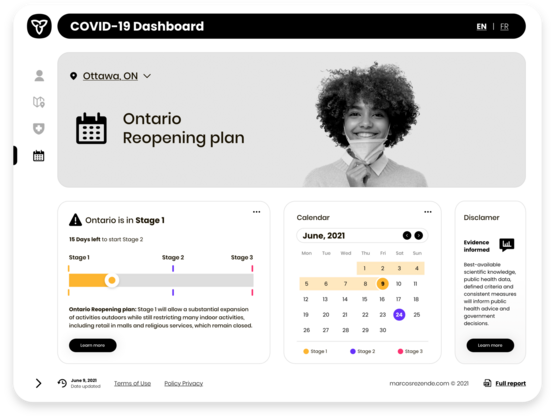
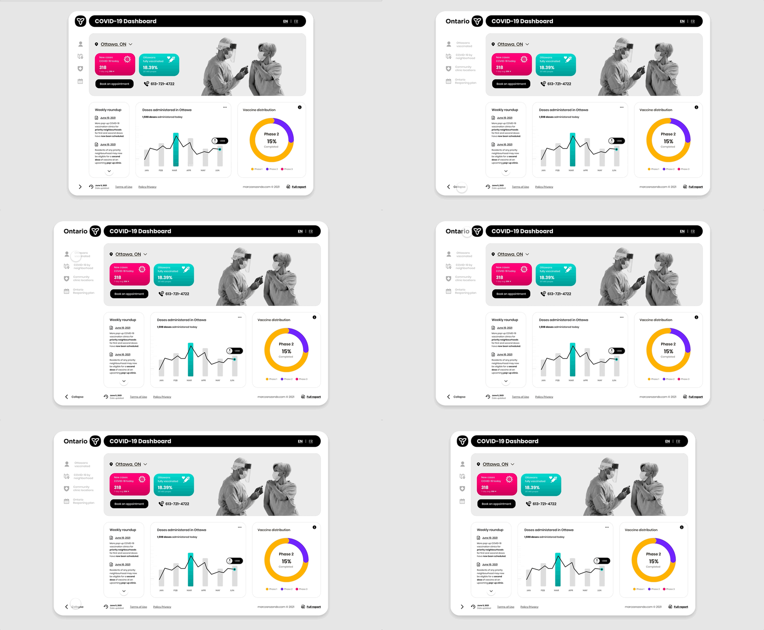
To minimize cognitive load and maximize usability, I designed an interface that prioritizes information through a strategic monochromatic component system. This approach reduces decision-making time by creating clear visual hierarchies that highlight priority content. Implementing principles of calm technology, the layout design requires minimal user attention while preventing information overload. Essential elements are organized into distinct sessions, ensuring users can focus on critical data without becoming overwhelmed.
Desktop version (Overview)
Desktop version (Extended Menu)
Mobile version (Overview)
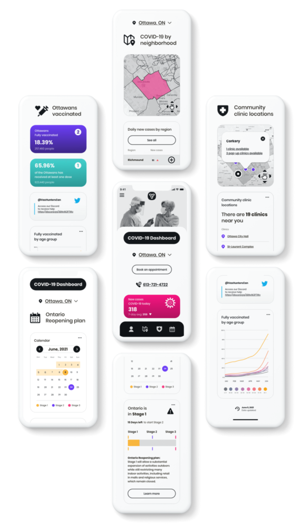
The concept project was fully responsive and customized for viewing on desktop, tablet, and mobile devices. Prioritizing access to essential elements of the dashboard through a visual hierarchy
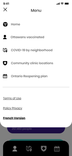
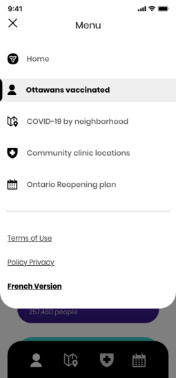
Mobile version (Menu)
Refirments and next steps
Based on a comprehensive review of Ontario residents’ needs, I hypothesized that a minimalist design in a multi-page dashboard could effectively adapt to new incoming information—a hypothesis that proved partially correct. To handle complex and detailed data effectively, implementing an organized and segmented approach became essential. Through this process, I identified several opportunities for improvement:
- Data Integrity: Establishing robust integration with reputable data sources to prevent misinformation and ensure data accuracy.
- Enhanced Visualization: Implementing full-screen functionality for individual charts on desktop versions, enabling users to analyze data more thoroughly and effectively.
- Adaptive Learning: Recognizing that users continuously adapt to new information and features, we implemented comprehensive user testing protocols. This approach helps measure performance accurately, mitigate cognitive biases, and validate future implementations.
The COVID-19 Dashboard represents an iterative design project focused on reimagining Ontario’s public health interface. As the pandemic situation evolves, the dashboard continues to be refined and updated to meet emerging needs and requirements.

